Mistakes To Avoid When Designing Challenge Coins
It's easy to craft great challenge coins by avoiding a few common mistakes
We have talked extensively about what makes a good challenge coin. We have also examined how custom coins are used and what elements make the best designs. Today we take a closer look at a few avoidable mistakes you should be aware of.
Challenge coins are unique, With hundreds, maybe even thousands of options to choose from, designing one can seem daunting. At ChallengeCoins4Less.com, we have nearly 20 years of experience, and we know what works and what doesn't. Below we share a few design mistakes that can easily be avoided.
Coin Size Matters
First things first, size does, in fact, matter. The most popular sized challenge coin is 1.75", though 1.5" and up to 2" coins are popular as well. Larger coins are becoming more popular because they can feature more details. However, choosing the right size has to do with preference, the purpose of the coin, and your budget.
Bigger might not be better, but choosing a coin that is too small will limit the rest of your design. It's all about the surface area, and a little can make a big difference in the look and feel of your coin. 1.75" coins are optimal, providing plenty of area for logos, text, and more.
Use Color Carefully
Next up, the color scheme. Color can add a unique dynamic to any challenge coin; however, the wrong colors can have the opposite effect. A smart color combination will add an eye-catching allure to your coin, as will the plating. High polish gold and silver plating options are the most popular, though they do not always provide the right look. High polish finishes are great for bold images with dark colors that will pop.
Challenge coins can feature several colors, adding great detail to your design. But, it shouldn't be used to fill in large areas of your coin. The right base will have a significant impact on the rest of your design, so choose wisely. The plating itself is great as a base color, adding visual depth to the entire design.
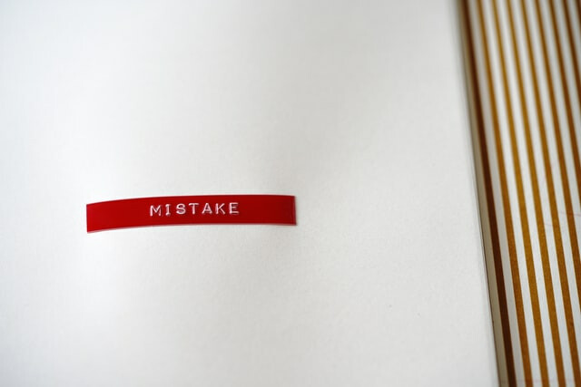
Remember to Proofread
One common mistake to avoid is not checking and double-checking your proof. We carefully check all of our work before it goes to our customers. However, small details and words can slip through. Ensure that your text is spelled correctly and is free of grammatical errors. Pay close attention to the proof of your coin and especially names, acronyms, and any words in a language other than English. And remember, once you approve the proof, any errors are your responsibility.
While spelling and grammar are important, be sure to check all of your content and the colors to make sure your design turns out how you envisioned it. We offer free art and revisions, further guaranteeing that your challenge coins will arrive just as you designed them.
Be sure the design is legible as well. Challenge coins should not be overly detailed. Be sure that text, imagery, and other details can be easily read. Integrate details that work well together, getting the point across without being too busy. Even in the absence of text, a simple image can be much more striking. Remember, the size of your coin will play a large role in how much you can include on your coin.
At ChallengeCoins4Less.com, we know what well-designed coins look like. As we mentioned earlier, we have nearly 20 years of experience and an incredible team of graphic artists. We can take any design and turn it into a striking challenge coin. Are you ready to get started with your order? Simply fill out our free quote form or email us. We’d be honored to work with you.
